The story behind the brand
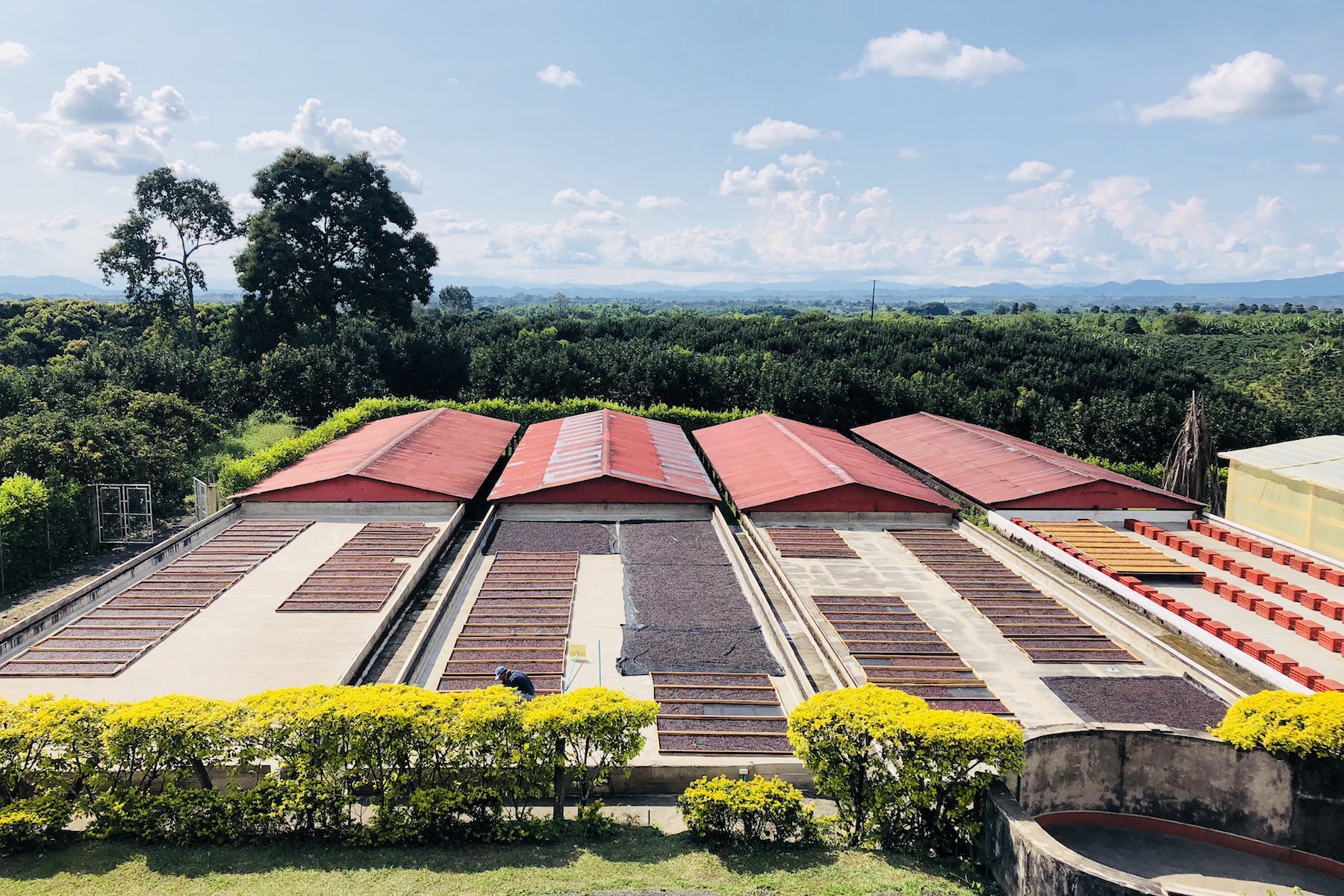
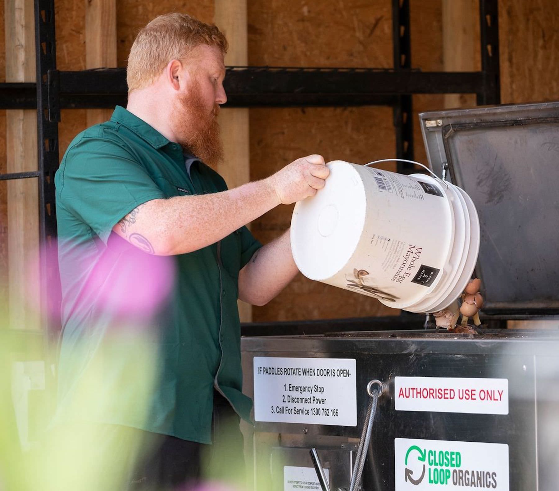
In recent years, Two Before Ten has been evolving to become more about sustainability than just coffee. The growth of the Urban Farm, community involvement and our approach to sourcing and waste management has seen our focus as a company change. In response to this, the designers at Pursuit Technology helped us update our brand to see these values better reflected. If you’ve been wondering about the meanings behind all the new symbols, here it is!
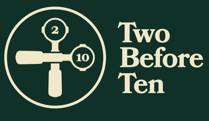
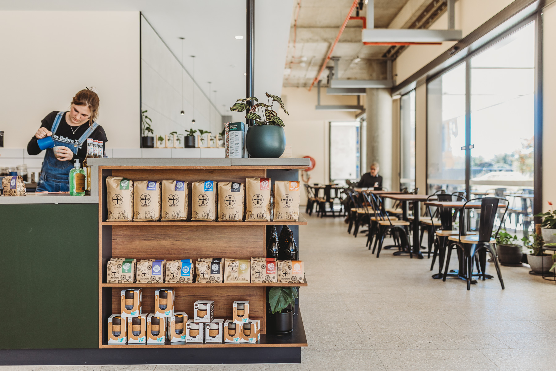
The circles
After conducting research into the TBT brand, the team at Pursuit noticed something that kept popping up – the recurring circle. The circle is the handmade mugs our coffees are served in, the freshly roasted beans rotating in the cooling tray, and the carefully plated seasonal foods.
The Pursuit team drew a link between this recurring imagery and the core tenants of our brand. The circle invokes images of a gathered community, inclusivity, connection and natural cycles. It also represents an ethos of regeneration and sustainability, the cycle of learning and questioning, of a circular economy and a zero-waste goal. In addition to this it draws a connection to Canberra and the origins of Two Before Ten. A city of roundabouts that planned its core infrastructure around the humble circle.
The designers at Pursuit took this concept and re-envisaged our imagery from scratch. The results are a collection of carefully considered symbols and designs that embrace the Twobie ideals while neatly encapsulating our place and history.
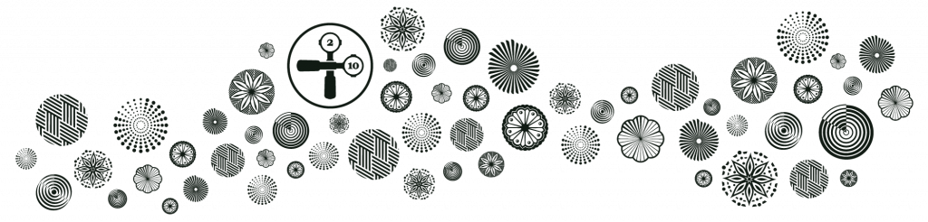
The symbols
Each of our coffee blends and drinks is represented by a symbol. They incorporate the circular motif and all that represents, plus a hidden meaning that alludes to TBT’s core identity. Inside every symbol is a subtle suggestion of the hands of a clock, pointing to 10am.
Juggernaut
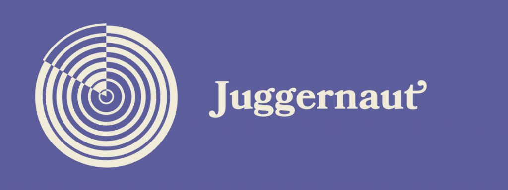
The beast of the Twobie roastery, representing over 70% of our coffee volume. Without Juggernaut we wouldn’t be complete. It’s the core of our cafes and the beginning of our growth as a coffee roastery. This symbol is like a tree trunk that grows year by year, getting stronger with age.
Atlas

This blend is complex, incorporating the most varying origins sourced from across the globe. Atlas was the first blend where we really started to focus on sourcing sustainably. Every origin in Atlas has a story behind it, from water-recycling programs in Burundi to regenerative agricultural practices in Papua New Guinea. The symbol of this blend reminds us of our interconnectedness with the wider world, and our responsibility towards everyone affected by our purchasing decisions.
Poundcake
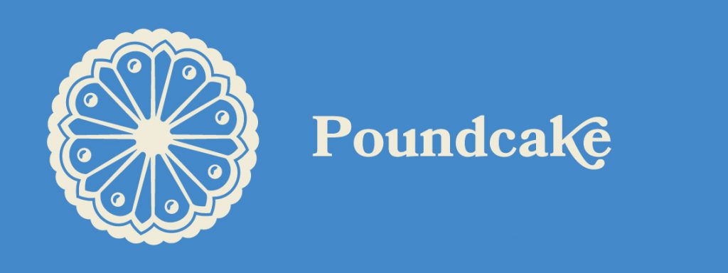
Poundcake has always been light, sweet and fun. Three components, in three equal values, using three different processing methods. To make something delicious with so few components demands the most creative and high quality ingredients that we can find. The origins comprising this blend are not your typical coffee flavours. Poundcake is an exciting yet balanced blend of a lighthearted nature – just like cake!
Proteus
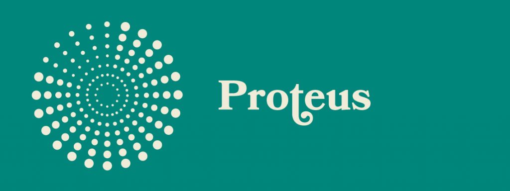
The limited batches, roaster’s blend. The meaning of Proteon is changeable in shape or form. In Greek mythology Proteus was the old man of the sea, subject to the sea god Poseidon. He could take whatever shape he wished and knew all things - past, present and future. This blend allows our roasters to experiment and learn from coffees old and new. The Proteus symbol is made up of drops in the ocean, representing the unending number of ways coffee origins can be processed, roasted and blended to create something truly unique.
Decaf
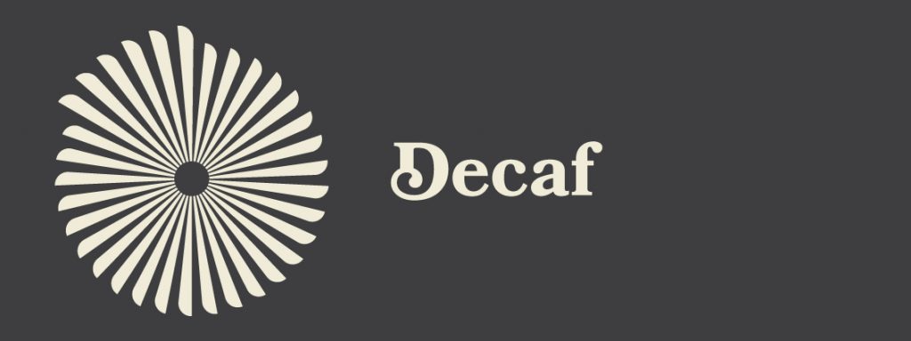
Coffee is a liquid delight that should be available to everyone. We take great pride in roasting delicious decaf that tastes just like other coffee, so that anyone who is sensitive to caffeine does not miss out. The symbol for our decaf coffee is a culmination of community, where each individual feels free and welcome to meet and spend time together regardless of their differences.
Single Origin Espresso Roast
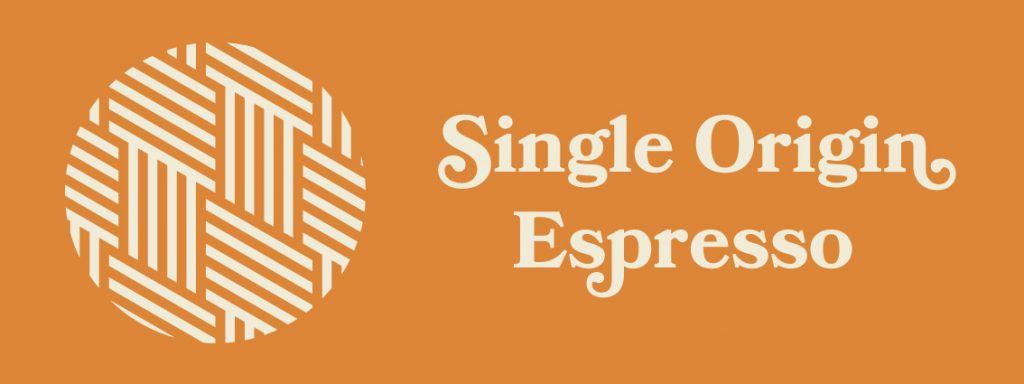
SOE is the weave of a hessian sack, of which all our green beans arrive in. When roasting this coffee of ever-changing origin it’s important to respect and pay tribute to its inherent attributes. The goal of roasting single origin for espresso is to let the flavours instilled at the farm shine, giving tasters an insight to the conditions in which it was grown.
Single Origin Filter Roast
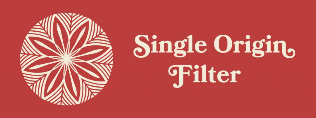
As with its espresso roasted sibling, single origin for filter brew methods should highlight the delicate aromas and flavour notes that come from the plants, soil and weather conditions where its grown. The coffee blossom for SOF’s symbol recognizes the magnificence and complexity of the natural world.
Hot Chocolate
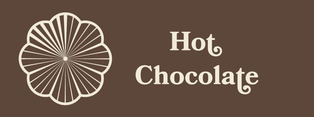
It’s not often we think of chocolate in its original fruit form, so this cacao pod symbol is a reminder of how this incredible seed starts out in the world. Our drinking chocolate is a mix of Malaysian dark cocoa powder and organic coconut sugar. Two ingredients that were destined to be together.
Spiced Chai
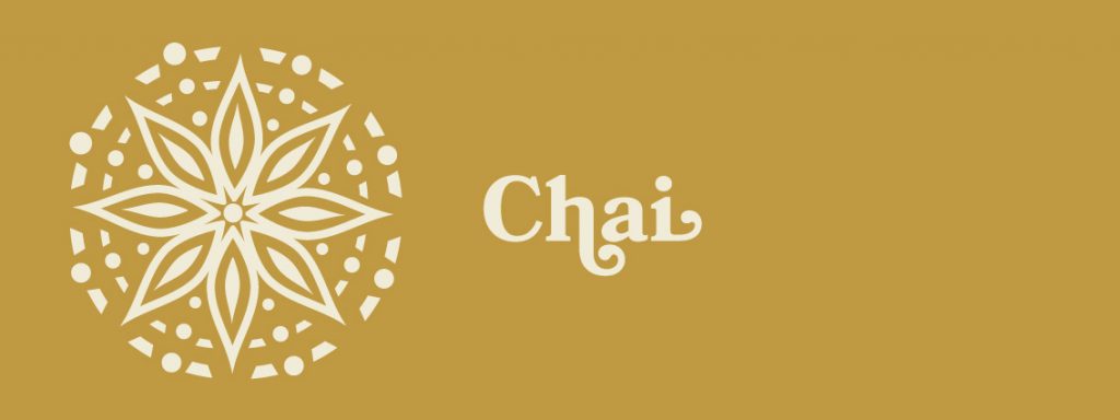
Star anise is one of the key ingredients in our house-made sticky chai. Combined with a myriad of other whole spices, local honey and Australian-grown tea, this complex brewed tea is right at home amongst the other TBT blends.
The colours
The colours used across the business also got an update. To reference the brand values of sustainability, farm-to-table and community involvement, our new colour scheme hints subtly at a sense of nature and quality craftsmanship. Primary black and white have been replaced by eggshell and dark jungle green, while earthy tones of leaves, wood, sand and wine comprise our secondary colours. The blend colours have also been adjusted to adapt to the nature-inspired theme, while still remaining recognisable as their former selves.